The Painted Primrose is a floral studio specializing in wedding flowers. We happily service the greater Boulder area, Estes Park, Lyons, Longmont, and beyond! Our passion is bringing a couple’s vision to life through complex color palettes, unique flower choices, and stunning designs.
Follow along for fun, flowers, and new things going on at the Painted Primrose.
BLOG
About
PROCESS
Love Notes
Portfolio
contact
December 1, 2020
Building Blocks of Color Scheme
In last week’s blog I talked about the basics of color and color theory to help you get started planning your wedding color scheme. If you missed it, check it out here. This week I wanted to introduce some color scheme building blocks that you can use to start planning your wedding colors. There are four main ones, and most color schemes are built off these basics.
Basic Color Schemes
Achromatic Color Scheme
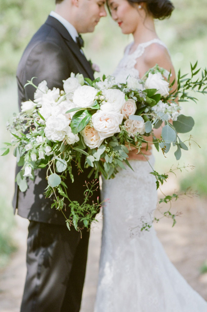
First, the most basic color scheme is what is known as achromatic. Achromatic means “without color” (I know, how can a color scheme have no color?? Confusing right?) But this just means any shade of black, white or grey. There are many different variations of this including adding a hint of warmth by adding red or yellow (think blush!) or coolness (hello pale blue) to the neutrals. In weddings this will commonly be seen in the classic “all white” color scheme: white with just hints of green in the florals. This color scheme could also serve as a backdrop for a pop of color. Black, white and gold is often considered very elegant, and white and grey serve as perfect complements for pinks. If you want one bold color to be the focus of your wedding this would be a great place to start!

An achromatic bridal bouquet focusing on a white color scheme
Monochromatic Color Scheme
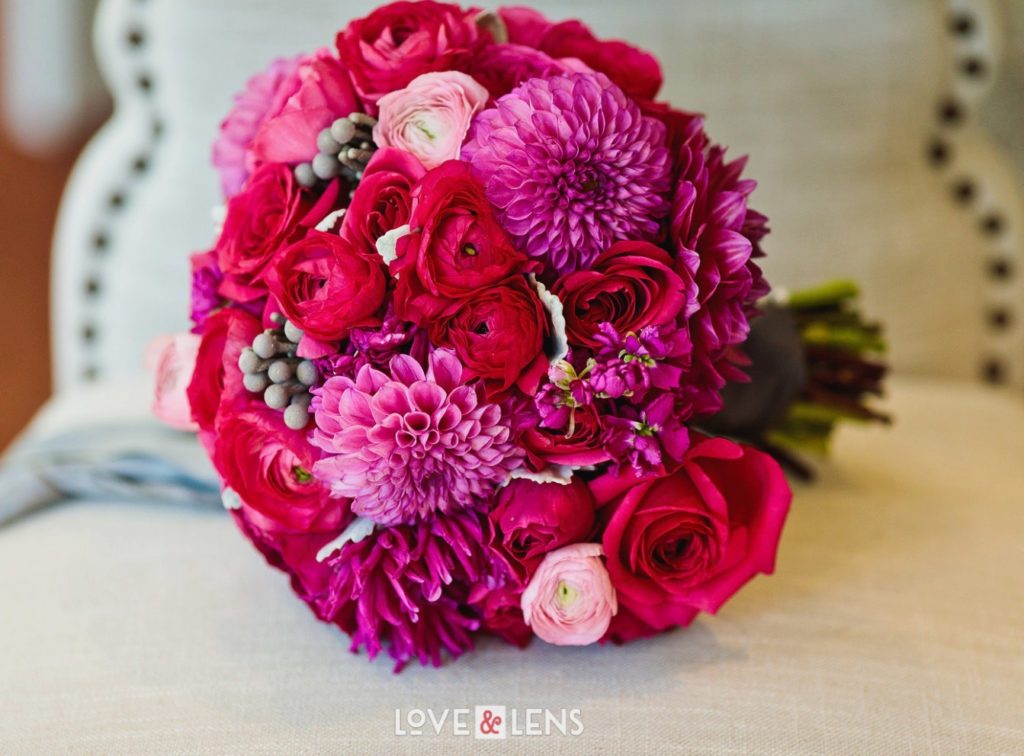
Building from the achromatic color scheme, is what’s known as a monochromatic scheme. Monochromatic means one color, so for this you would choose one color and mix varying shades and tones of that color. For example, you could use red, burgundy and pink, or emerald and sage. This is also a very popular trend in bridesmaid dresses right now as brides lean more toward letting their girls pick!

Monochromatic pink bridal bouquet
Analogous Color Scheme
One more step up from monochromatic, we have analogous color schemes. When choosing colors for this you would refer back to your trusty color wheel and select colors that are grouped next to each other. Think orange, peach and yellow or navy and forest green. This is also very on-trend for those mix ‘n’ match bridesmaid’s dresses I mentioned!

Analogous bridal bouquet with peach, yellow and orange
Complementary Color Scheme
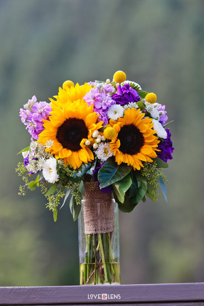
Finally, the last color scheme building block I typically see people use is complementary. Like I mentioned last week, complementary colors are colors that are directly opposite each other on the color wheel. We commonly see this in our winter bouquets featuring those luxurious deep reds and greens. However, this could also be teal and copper, purple and gold or indigo and marigold.

Purple and gold complementary bouquet
[…] on tips for planning your color scheme. If you missed those posts, you can check out last week’s here. In the studio for the past couple of weeks we have been hard at work spreading Christmas cheer […]
[…] toward these colors when they want something formal, classic, elegant and simple. In one of our previous blogs, we talked about using an achromatic color scheme, meaning “no color.” Typically we see […]