The Painted Primrose is a floral studio specializing in wedding flowers. We happily service the greater Boulder area, Estes Park, Lyons, Longmont, and beyond! Our passion is bringing a couple’s vision to life through complex color palettes, unique flower choices, and stunning designs.
Follow along for fun, flowers, and new things going on at the Painted Primrose.
BLOG
About
PROCESS
Love Notes
Portfolio
contact
November 21, 2020
Color Theory Basics
As we step into engagement season surrounding the holidays, many new couples are going to be jumping into wedding planning in the next few weeks! Let me start by saying congratulations!
One of the most important parts of planning a wedding is choosing a color scheme! The right colors affect everything from the mood of your day all the way down to how your photos look. One of the key things to think about when choosing a color scheme, is of course, flowers. There are so many aspects of color schemes to talk about, that I decided to do a whole series on it! For this first blog, I wanted to focus on the basics of color theory.
The Color Wheel
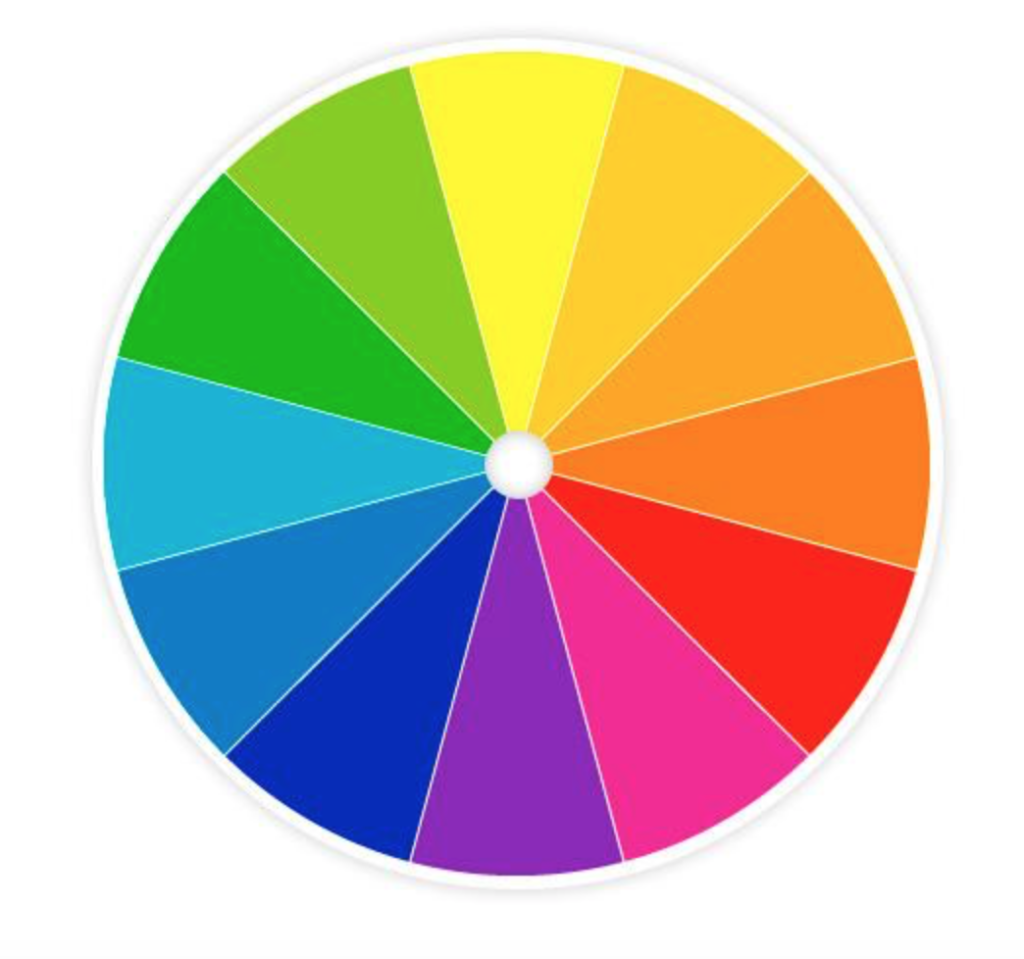
Basic color wheel, from hgtv.com
You probably remember learning about the color wheel in elementary school art class, but for those of you who may not remember, the color wheel is exactly what it sounds like: colors arranged in a wheel or disc shape, used to visualize color relationships. This can also be a really valuable tool when thinking about floral color schemes, check out this fun link to play with color schemes!
The color wheel starts with the primary colors, blue, red and yellow, and builds from there. The base three are combined together to create all the other colors. Green, purple and orange, these are known as secondary colors. After that, with some more mixing, you get down to tertiary colors (these are your teals, fuschias etc…)
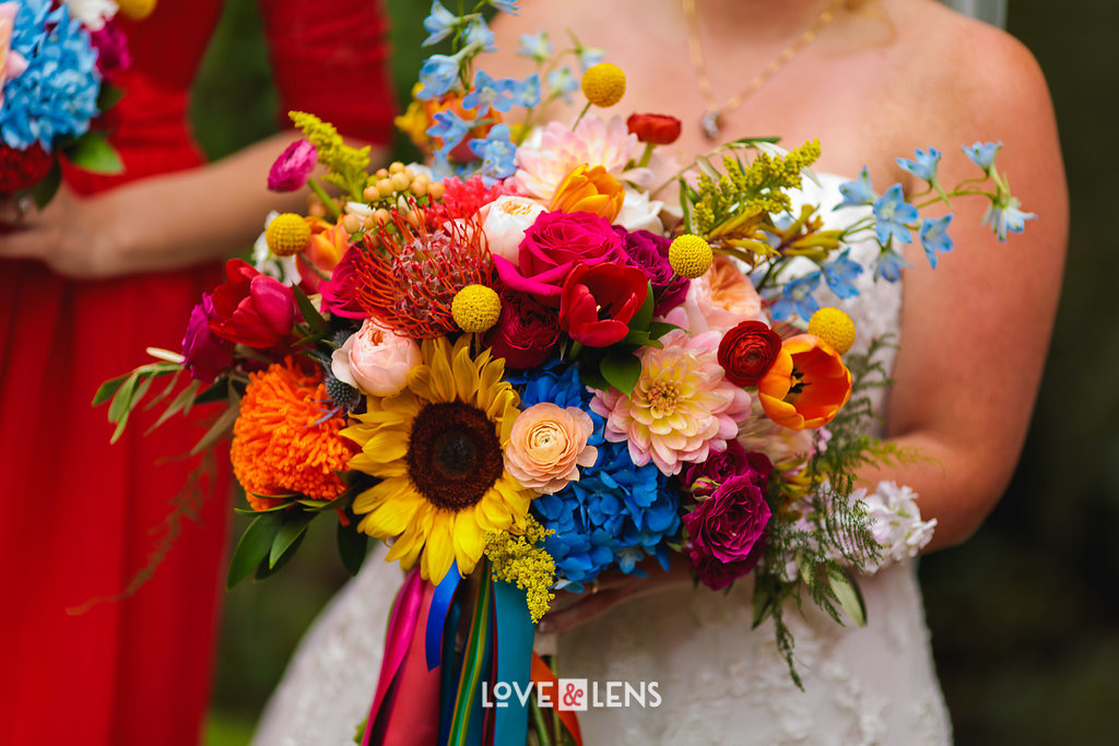
Bridal bouquet featuring bright, primary colors
Now that you know the basic colors, you can use the color wheel to determine color relationships. Luckily for you, most of the hard work is already done! There are few basic color relationships that are easy to start with.
Color Relationships
First, you have complementary colors, something else you probably remember from school. These are colors that are opposite each other on the color wheel. Think the red and green tones of traditional Christmas, or regal purples and golds. This can be as subtle as a red rose surrounded by lush emerald greenery, or as striking as orange and teal.
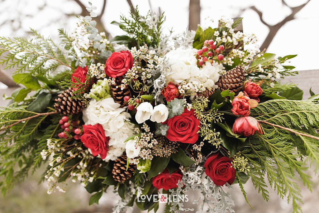
Arch piece featuring complementary reds and greens.
After complementary colors you have harmonious colors, which are ones that are next to each other on the color wheel. Orange, gold and yellow used together is a common way to blend a wide variety of colors into one wedding, and still maintain a flowing, harmonious look.
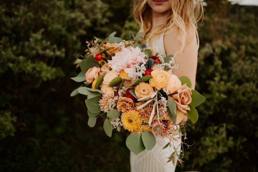
Harmonious bridal bouquet featuring orange, yellow and blush
Other Aspects
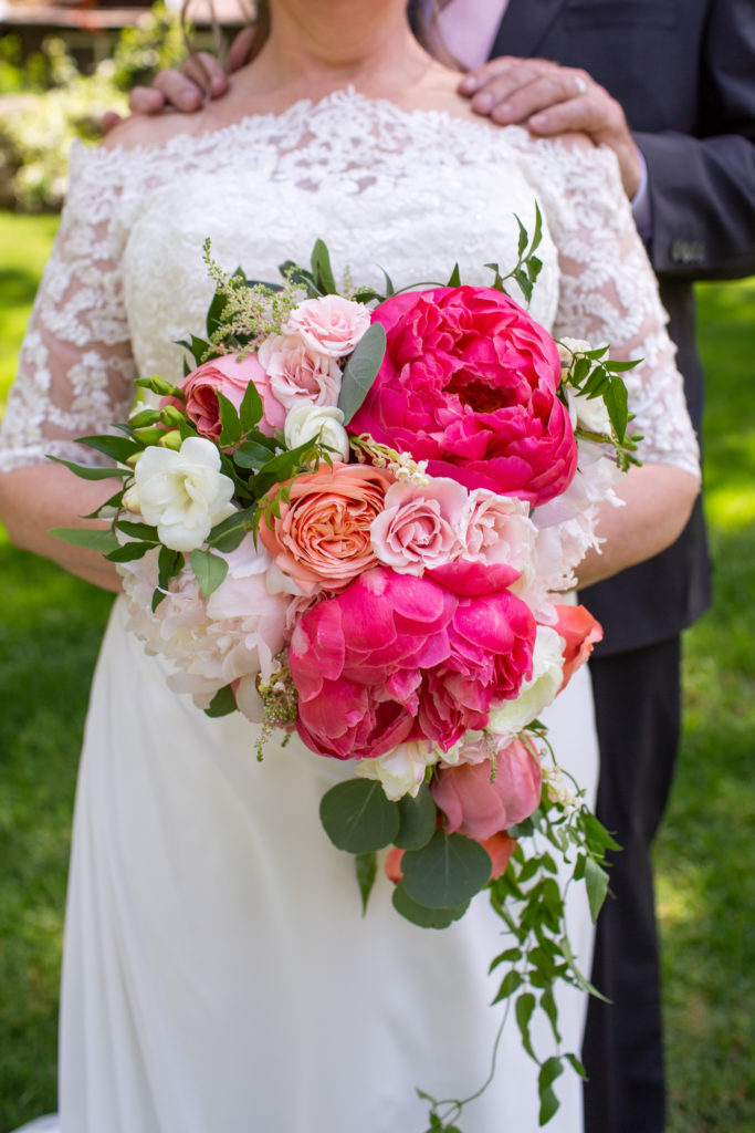
Bridal bouquet featuring different pink hues.
Another thing to think about when considering the basics of flower color is saturation or hue. This is what we would describe as the lightness or darkness of a color. For example, red can range from a deep burgundy to the lightest pink, and so can your flowers! You might think about using only one color in many different shades.
The final basic of color theory I wanted to cover is the tone of the colors. Colors range from warm, to neutral, to cool, and give off different moods based on this. Warm colors are your reds and yellows, that often evoke energy and passion. Cool colors include green and blue and are often considered more subdued than the brightness of the warm colors. Then you have neutrals, which are, of course, neutral and are typically used as the backdrop for other colors. The feeling of neutral colors is more directly influenced by surrounding colors than other colors.
Stay tuned for more information on choosing a wedding color scheme, real highlights and more!
[…] theory to help you get started planning your wedding color scheme. If you missed it, check it out here. This week I wanted to introduce some color scheme building blocks that you can use to start […]
[…] Often, when people are thinking about color meanings they start thinking directly about the mood certain colors invoke. The best examples of this are the differences between warm and cool colors. Warm colors generally invoke passion, fun and energy. On the other hand, cool colors are generally looked at as more subdued, serious and formal. You can read more about warm and cool colors here. […]